“Opportunistic analysis” sounds easier than it really is
First some background. As I explained in my first post, I work in a marketing department now but I used to work for the Department of the Army. I worked hard to make my data as publicly-releasable as possible because I worked on long-term, strategic types of issues. Before I left, it was standard practice to turn some of the analyses into manuscripts for open publication, and I’m still working on those manuscripts now that I’ve left. I was working on one last night – a project on attacks in Afghanistan – and realized it might be useful to have a monthly record of overall troop levels to augment one part of the analysis.
Holy cow, it’s really hard to get that information.
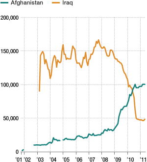
You might be thinking that I’m just a poor planner. I worked for the Army, so it seems I should have thought of this need earlier and figured out how to get those numbers a long time ago. I actually did think of this need earlier – a couple of years ago. I looked for the information then and couldn’t find it. The frustration of that search seems to have dimmed in my memory over the ensuing period of time, but it all came back in a wave last night. For example, take a look at this:
It’s a graph of troop levels in Iraq and Afghanistan that was presented in an NPR story. The original is here. Notice the Afghanistan line is missing in parts. On the original web page, underneath the graph, it says two things: “Note: Data not available for some months” and “Source: Department of Defense.” In other words, NPR got those data from the people who are actually conducting the war, and those people themselves didn’t know how many troops were on the ground for some months.
This isn’t just a case of NPR not getting access to the data. The Congressional Research Service wasn’t able to get it either. In this report, they have to spend a few pages explaining how there was no straight answer to the question of how many troops were in Afghanistan at any given time. Part of that is a legitimate definitional problem – large-scale troop records often talk about the operation to which the troops were assigned, not the location. So a lot of troops assigned to the Afghanistan conflict were actually residing in other countries, doing support work. However, part of the problem was that the CRS actually got conflicting reports. They said the “Boots on the Ground” reports, prepared by the Department of Defense, probably contained the best estimates, but those could be biased if troops were “not present on the day of the head count.” That’s right. When DoD wanted to know how many troops they had in Afghanistan, they had to go count them. Footnote 89 is also interesting:”DOD did not send Congress Boots on the Ground Reports for October 1 and November 1, 2008.”
So we can’t assume that the data are actually stored some place and that the public just doesn’t have access to them. It seems it’s actually realistic to believe that perhaps no one has really been keeping those sorts of records.
So I started looking for other sources. That’s when I came across this:
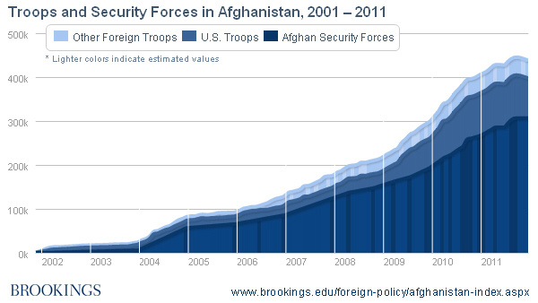
What’s I’ve pasted here is actually a still of this interactive graph produced as part of the Brookings Institution’s Afghanistan Index. If you roll your mouse over any particular part of the graph, it will tell you how many Afghan Security Forces, U.S. troops, and other foreign troops were in the country at any given time. As the graph says, they had to estimate levels for many months, but at least they have the estimates – and they’re up front with how they arrived at them.
Here’s the thing, though: the only way to get those actual numbers – to use anything but the graph itself in an analysis – you have to run your mouse over each section of the graph and record each number individually. I think they must have all that information in a spreadsheet somewhere – the graph has to come from someplace – but it’s not available on the site. Last night, I emailed the people who put the Afghanistan Index together and asked them for the data itself. I haven’t heard back from them yet. I hope I can get the data from them eventually.
My point is that it shouldn’t be this hard. There are potentially useful things people could do with a monthly record (even an estimated one) of troop levels in Afghanistan. Similarly, iCasualties.org has impressively kept a record of every casualty in Iraq and Afghanistan for which the site’s author could find a press release or news story. The entire list of fatalities in Afghanistan is laid out here. [http://icasualties.org/OEF/Fatalities.aspx] The problem is, the list only displays 50 records per page. There are 58 pages. If you want the whole data set, you have to copy and paste each page individually. Granted, that’s not as frustrating as reading monthly data for three different types of troops off of mouse hovers on the Brookings Institution’s page, but it still makes it difficult for an analyst to use data in potentially useful and informative ways.
I’m a little frustrated at the DoD for not making their data more available, but I think I’ve come to terms with it. The military is used to being overly cautious with its information, and most people I met in the military felt that they had more pressing concerns than maintaining databases. I’d argue that maintaining better databases could help them with some of those other pressing concerns, but I can understand if they don’t give my argument much credence.
What I understand less, and what frustrates me more, is the non-government sites that recognize the value of giving people information – that’s actually a large part of the reasons those sites give to justify their existences – but then present that information in graphs and PDF-ed tables. They basically present the information in the least-accessible format for statistical analysis. They can’t have created their graphs or the PDFs without first having a database or a spreadsheet or something. It would be so easy to include a link. But it’s really rare to find that kind of link. And it’s not just the U.S. government and it’s not just Afghanistan. I’ve run into the same problem with data from NGOs in India, the Mexican government, and the U.N.
I’m a big advocate of opportunistic analysis. I think some really insightful stuff has come from people who took data that was just lying around in different places, put all of it together in one place, and then employed some rigorous analytic tools to find patterns. I think that kind of work is not only necessary in research environments where a researcher’s employer is more concerned with day-to-day operational and business outcomes than with achieving a consistently deeper understanding of an issue, but I also think it’s exciting. I get excited when I find governments, NGOs, and other groups dedicated to making information available, who recognize the potential benefits of letting people take advantage of open information. I wish these organizations realized that available information isn’t the same as usable information. I have more available information than I can handle. I have precious little usable information. That’s a problem for organizations who want their data to be used. I only have so much time and energy. More often than not, if the data are available but difficult to access, I’m going to choose a different project or a different way to address my questions. There are a lot of opportunities out there. The opportunities that are the easiest to access will be the ones that get the most use, garner the most attention, and do the most good.
If you want to comment on this post, write it up somewhere public and let us know - we'll join in. If you have a question, please email the author at schaun.wheeler@gmail.com.

